I love seeing home tours that real people live in.
Ok, I know real people live in every home, but sometimes it doesn’t seem like it.
Cassandra’s, from Coco + Kelly, home was recently featured in Rue Magazine and I am in love.

Although her apartment is styled perfectly, it stills feels warm, cozy, and live-able.

A few things I love:
1. The neutral color scheme with pops of color.

2. $7.00 dotted Ikea pillow!
It seems to work in every space!

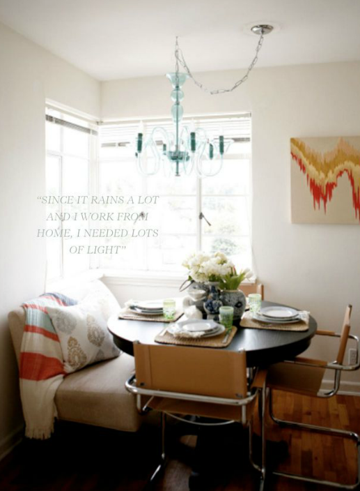
3. That her living room, dining room, and office is one big room (welcome to my life!).
It’s small but so fabulous.
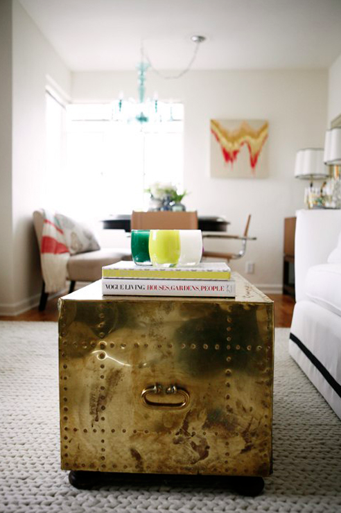
4. She had to swag her chandelier but still made it look great.
How many of us have this problem?!
5. The bench seating.
Doesn’t it gives the illusion of a custom banquette? An awesome idea for a small space.

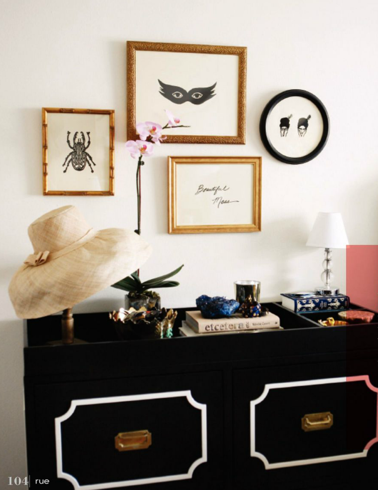
6. The dresser.
I love it, I need it.
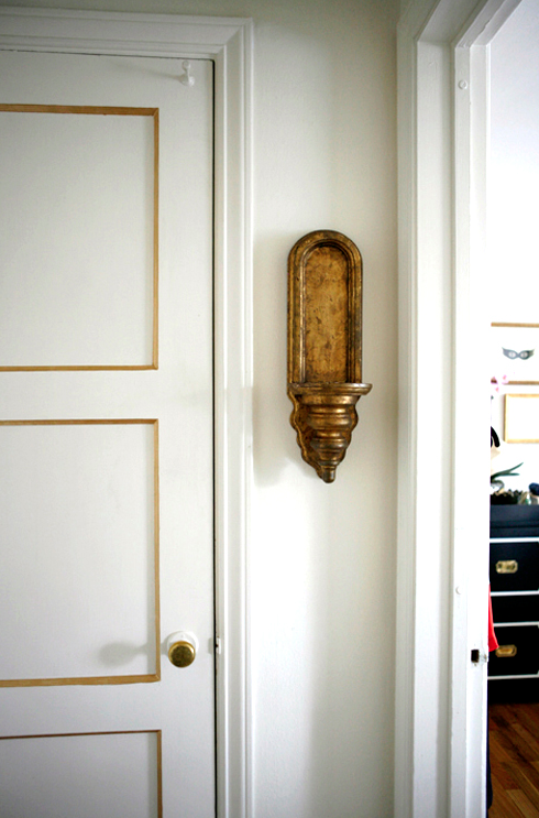
7. The gold trim on the doors.
Such a simple detail but adds so much!
{all images from Rue Magazine and Coco + Kelly}
Did you enjoy this home tour as much as I did?
It is pretty awesome.
You can see more from the newest issue of Rue here!
it was awesome! Love that dresser too
I agree.. I was completely smitten by the whole space. It’s the look I love but somehome can’t recreate.. someone help me! 🙂
Loved it too- my favourite part was the gold on the doors- so stealing that idea:)
Soo good – the trim on the door is one of my favorite details – I want the sofa, too!
Gorgeous! I absolutely love the colour scheme and all the great art!
Yes, this place is beautiful!! Love the styling and details everywhere but it’s not overdone. Very simple and cozy!
Love it! So simple and chic. Also one of the most interesting campaign dresser I’ve seen. I may have to try that on my own campaign dresser!
eee! I love it! So much inspiration, thanks for sharing!
Man I am so behind on my magazines this month! It’s awesome! Gotta go check it out.
Its fabulous! I love her headboard
Love the whole space and all the details!
Love it- such a gorgeous space especially all the well thought out details!
It is beautiful; she is carrying the “gold/neutral” scheme throughout which helps the flow from room to room, and the pops of color are just that, a pop here and there that also coordinate (purple and green and orange). The neutral palette with a gold/tan color scheme is the key.
Love it all. That Ikea pillow is popping up everywhere – perfect!
I am with you. I love to see “real” homes too! If they have kids all the better!